


For years, Android’s interface has been on a journey of refinement. With its latest evolution, Google isn’t just tweaking icons or shifting pixels; it’s orchestrating a fundamental UI update that rethinks how we interact with our smartphones. This transformation is powered by Material You, the dynamic and personalize design language that’s now maturing into its most cohesive form yet, often referred to as Material 3 design.
This isn't a change that happens in the background. It’s a visual and experiential shift that places you at the center of your device’s identity. If you’re holding a Pixel smartphone from the Pixel 6 series or newer, this update is especially for you, delivering a more intuitive, expressive, and smooth Google user experience.
In this deep dive, we’ll unpack everything you need to know about Android’s latest chapter. We’ll explore the most significant visual changes, the philosophy behind the design, the specific benefits for Pixel owners, and what this means for the future of Android design evolution.
What is Material You and Material 3?
Before we examine the changes, let's clarify the terminology. Material You (also known as Material Design 3 or M3) is the third major iteration of Google’s design system. First introduced with Android 12, its core principle is personalization. It moves beyond a one-size-fits-all approach, using algorithms to extract colors from your wallpaper and applying them across the entire operating system—from buttons and sliders to notifications and widgets.
This UI overhaul creates a unique color palette for every user, making each device feel personally tailored. Material 3 expands on this, refining the components, improving accessibility, and creating a more harmonious ecosystem across phones, tablets, watches, and foldables.
The Most Significant Visual Changes in the Android UI Update
The latest iteration of Android, particularly through feature drops for Pixel devices, brings these Material 3 principles to the forefront. The changes are both bold and subtle, creating a fresher, more modern interface.
1. Dynamic Color Theming and Monet
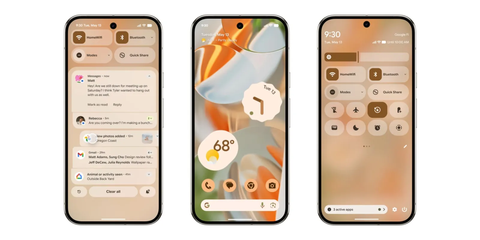
The most instantly recognizable change is the expansive and sophisticated use of color. The system, internally called "Monet," goes beyond just applying a single accent color. It generates a complete palette of five key colors and twelve derivatives, ensuring a balanced and accessible look across all apps that support the theme. This creates a deeply unified and aesthetically pleasing environment that feels truly yours.
2. Redesigned, Expressive Widgets
Widgets are no longer simple information squares; they are dynamic extensions of your home screen's style. They adapt their shape, color, and even typography to match your selected theme. Google’s first-party widgets, for Calendar, Clock, and At a Glance, have been completely redesigned with more useful information and a cleaner, more intuitive layout that prioritizes glanceability.
3. Refined Typography and Shapes
Material 3 introduces a new default typeface, Google Sans Text, which offers improved readability and a more modern geometric feel. Furthermore, UI elements feature new rounded shapes and more generous spacing. Buttons, cards, and menus have softer, pill-shaped corners, creating a friendlier and less rigid visual language.
4. Redesigned System-Wide Modules
Key system interfaces have received a significant facelift:
Quick Settings Panel: The toggle switches are larger and easier to tap, with a brighter background that makes them stand out. The layout is cleaner, reducing visual clutter.
Notification Shade: Notifications are now grouped with more distinct separators and use your dynamic color theme for action buttons, making them easier to parse at a glance.
Lock Screen: The clock widget on the lock screen is larger and bolder, and it dynamically changes size when notifications are present to improve usability.
How Material 3 Design Enhances User Interaction and Experience
This overhaul is far more than skin-deep. The visual changes are in service of a more intuitive and accessible user experience.
Improved Accessibility: The automated color theming is designed with contrast and accessibility in mind. By generating a full palette from your wallpaper, it ensures text remains readable and interactive elements are clearly distinguishable against their backgrounds, benefiting users with visual impairments.
Streamlined Navigation: The larger touch targets on toggles and buttons, combined with clearer visual hierarchies, reduce user error and make one-handed operation more feasible. The design provides clearer signposts, so users always know where they are and what they can do.
Reduced Cognitive Load: The consistent application of color and shape across the system creates a predictable environment. When all apps and menus follow the same design rules, users don’t have to "relearn" how to interact with different parts of their phone, making the entire experience feel smoother and less mentally taxing.
A Focus on Pixel: Which Models Get the Premium Experience?
While aspects of Material 3 trickle down to other Android devices through Google app updates and Android version upgrades, Google’s Pixel smartphones are the flagship vessels for this experience. The deep system-level integration, including the dynamic theming engine, is a hallmark of the Pixel interface.
This latest wave of the UI update is optimized for and fully available on Pixel 6, Pixel 6 Pro, Pixel 6a, Pixel 7, Pixel 7 Pro, Pixel 7a, Pixel Fold, Pixel Tablet, Pixel 8, and Pixel 8 Pro. Owners of these devices will see the most cohesive and feature-complete implementation of Material 3, as Google uses its hardware to showcase the software's full potential.
Performance Improvements and Technical Implications
A common concern with any major visual update is performance. Will the new animations and effects slow down my device? Interestingly, Google has coupled this design shift with under-the-hood optimizations.
The company has focused on reducing jank—those small stutters or dropped frames in animation. By refining the rendering pipeline and how the system handles animations, the latest Android versions feel consistently smooth. Tasks like switching apps, pulling down the notification shade, and navigating home feel fluid and immediate. This technical work ensures the beautiful new design doesn’t come at the cost of speed or responsiveness, a critical balance in modern Android design evolution.
Material 3 vs. Material 2: A Comparative Evolution
To truly appreciate this update, it helps to see how far Android's design has come.
Material 2 (c. 2018): Was characterized by stark white backgrounds, sharp shadows, and a single, bold accent color (often blue). It was clean but could feel clinical and uniform.
Material 3 (Now): Embraces color, personalization, and adaptability. It replaces overwhelming white space with softer, color-filled backgrounds and adaptive components. It’s less rigid, more organic, and fundamentally user-centric rather than system-centric.
This shift represents Google’s growing confidence in its design philosophy, moving from a strict, guideline-heavy system to a flexible, expressive, and empathetic one.

The Future of Android's Design Language
This UI makeover is not the finish line but a signpost for the future. Google is clearly investing in an ecosystem where your phone, watch, tablet, and even computer can share a cohesive and personalized design language. The principles of Material 3 are already evident in Wear OS and on the web.
The focus will likely remain on contextual adaptability—interfaces that change not just based on your wallpaper, but also on how you’re using the device, the time of day, or your location. The goal is a seamless, intelligent, and effortlessly helpful Google user experience that works across your entire digital life.

A More Personal and Polished Pixel
Android’s latest UI update is a testament to the platform's maturity. It’s a thoughtful, comprehensive UI overhaul that successfully balances radical personalization with refined usability. For Pixel smartphone users, it transforms the device from a mere tool into a personal expression, all while smoothing out the technical rough edges for a more reliable daily experience.
The Material 3 design language is more than a new coat of paint; it's a framework for the next decade of digital interaction—one that is inclusive, adaptive, and, most importantly, uniquely yours. If you have a supported Pixel, dive into the wallpaper and style settings. Experiment. Customize. This is the most personal and polished Android has ever been, and it’s designed for you to make it your own.


z****i@gmail.com
11/27/2025 5:15:01 AMcheck more out here